About
In the past few months, I worked as a user interface (UI) design intern making e-commerce website templates. Those templates cover the design of homepage, product list page, product detail page and etc,.
During my internship, I participated in the design of several sets of templates with various features and styles. This article is a simple review of those experience.
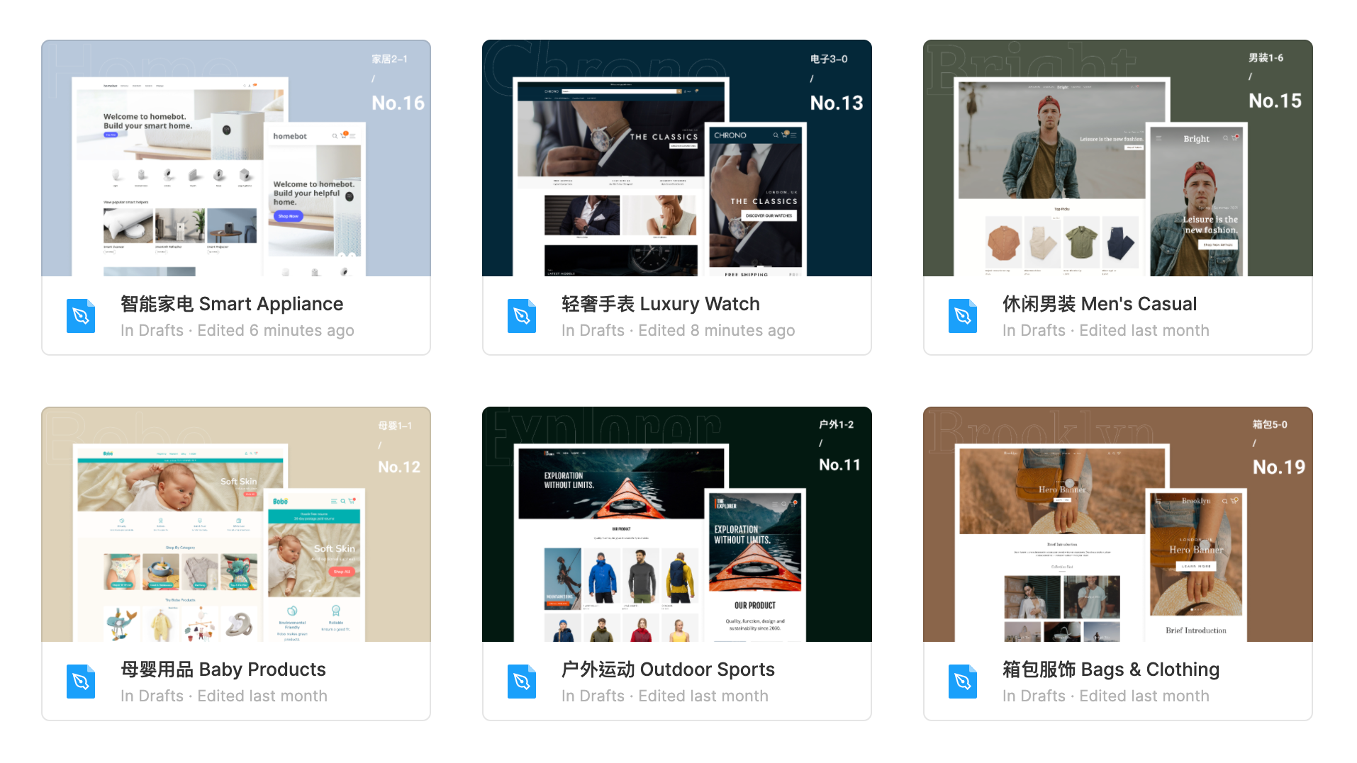
This is a sample template site: 🔗 Site link
More Than Just Color
At the beginning of each template design, in-depth researches are required to determine the overall design style. Details of graphic design elements are to be decided, such as color, font, straight or rounded angles and etc,. However, template design requires more attention besides color and font.
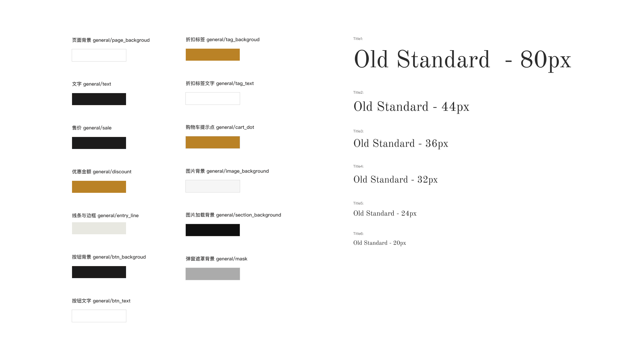
The following figure shows an example of specification on color and font:
A challenge in template design is that we need to consider not only the users of the web page (that is, buyers in the e-commerce platform), but also the users of the template (that is, the merchants in the e-commerce platform). Therefore, besides the final layout of the template, designers are also obliged to pay attentention to the potential needs in using the template.
Designing a website template is more than just creating a style. A good template should be easy to use and give users certain space for customization - after all, nobody would like their website to be identical to others.
Freedom & Restriction
Giving users the freedom to customize is not an easy task. First of all, there are two question to answer: 1. Where can users customize; 2. How can they customize. For example, are users able to modify the font size? If so, what is the range of the font size?
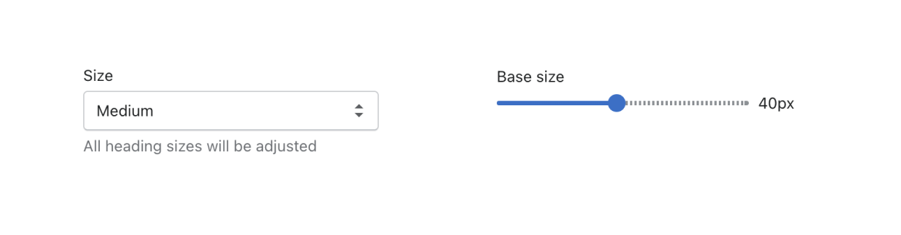
In most cases, more freedom does not do lead to better template. Users would likely to be confused facing too many choices, which is the opposite of what we want for usability. For example, one template only has three options for font size: large, medium, and small. Another template let the users choose from 32px to 72px as the font size. It seems that the latter has more freedom, but the result shows that users prefer to use the former - the simpler and more straightforward template.
The below figure shows the two ways of choosing font size:
Another reason to restrict the customization is to maintain the origin style of the website as much as possible. Not all users are designers, for example, they may not know how to choose proper colors. They might easily destroy the intended style of the original template if they can choose all colors freely. Therefore, designers need to do their best to maintain the origin design of the template when considering customizations.
In a nutshell, the balance among usability, style and freedom of customization should be well maintained.
To The Extremes
There are often several rounds of testing before the release of the template, in order to make sure that there are no major bugs before it goes online. Extreme cases are mainly considered in testing, such as the largest and smallest screen size.
This process is quite similar to testing programs. When testing whether a program is robust enough, it is necessary to test the input of the extreme values, as well as the “0” and “1”.
Although extreme values won’t occur in most cases, whether a template is reliable enough often depends on these boundaries.
Finally
Looking back on this template design experience, besides my greatly improved Figma skills, I might have also developed a “reversed intuition” from high-fidelity to low-fidelity design. When thinking about how to open parts of the webpage for customization, one would gradually figure out the most essential structure of webpages.